Every developer I know has rebuilt their portfolio at least twice. I've lost count. It's one of those projects that never feels done. The moment you ship it, you're already mentally overthinking it. But it's safe to say, I'm finally happy with how the last iteration came out.
Where It Started
I bought the domain "deeksha.io" in 2023 and had been planning my portfolio since then, I tried to come up with something but never landed on the "perfect" design. At some point I gave in and made an editorial style website, eventually hated it and took it off the internet but I was still looking out for inspiration. A portfolio website is extremely personal, so for the second iteration, I knew I wanted to take time and craft the best one that represented me. After scrolling through dribble, "portfolio design ideas", I finally found a good design that I liked on a designer's instagram page this gave me a brief idea about how I wanted to structure my website, but before developing I mentally planned on what I wanted to communicate to the people visiting the website. I enjoy story telling, so I knew my website would be full of stories, from inception to the final product.
In AntStack, when we were hiring, we would spend a lot of time reviewing candidates' profiles, most of the portfolios in the resume just looked like a reused template (yes, I was judging others' porfolio when I didn't have one 😬 ) This is what pushed me to come up with something unique.
The Bento design
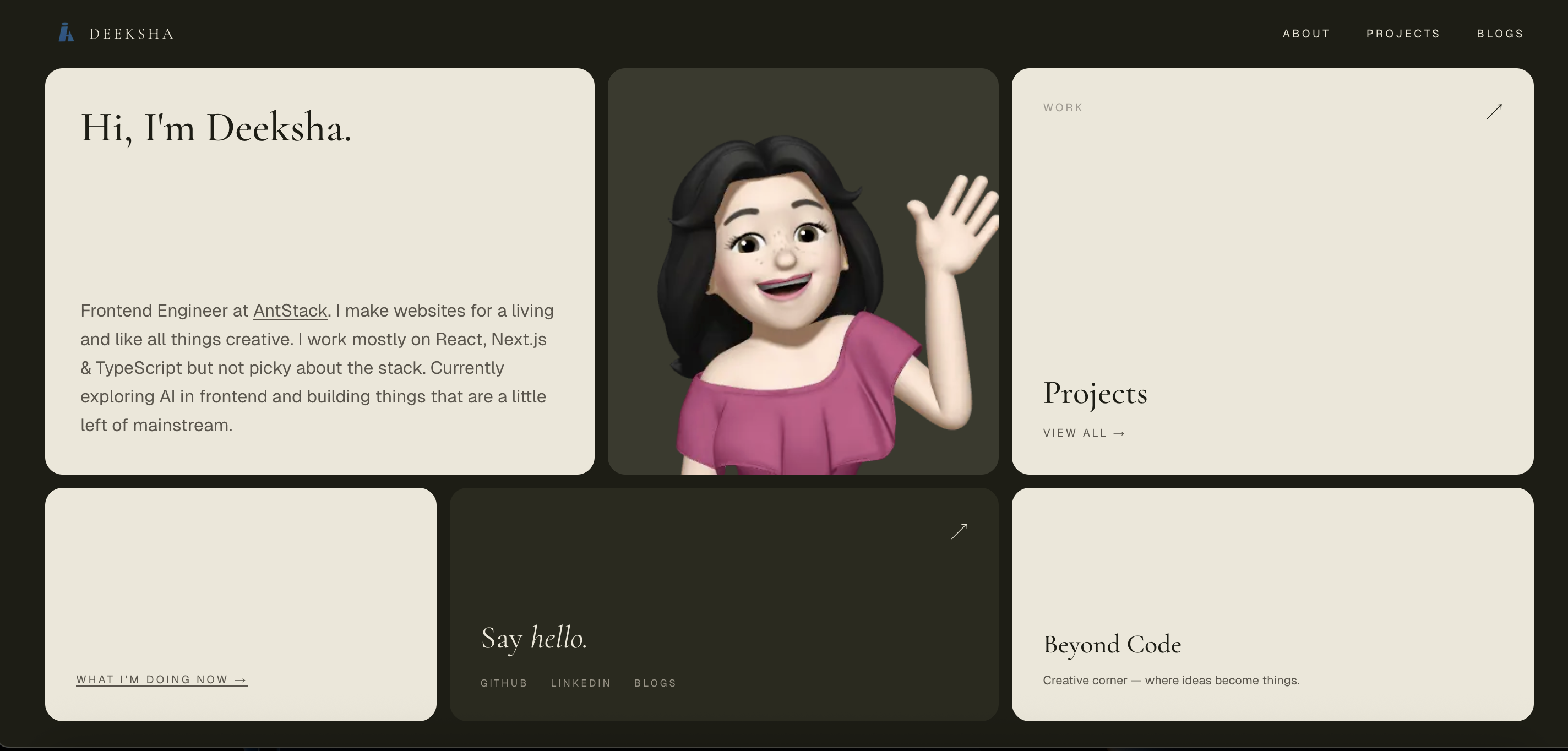
Instead of being stuck at the planning stage, I finally started working on my portfolio. Based on the design I saw on instagram, I started developing the website which had a bento design, it was warm. Browns and beiges. It looked clean. It worked. I wasn't unhappy with it, it just had a lot of white spaces which I didn't know what to do about, what to fill in, that kept bothering me, I kept trying different variations of the grid but somehow it just didn't sit right, the white spaces and me trying to fit things to avoid it all just felt like I was trying really hard to make something work that was hanging by a thread. Ultimately I stared long at it to not like it anymore and decided to change it and do a different design from scratch.
The No scroll or Above the Fold design
The main reason why I liked the bento design was that unlike editorial, everything stayed on the user's viewport, this was still a priority for me and hence I kept trying to make something in the single screen layout style but ended up making it look very boring. Again, I tried to make something interesting out of it, but it wasn't working.
Claude suggested designs
Finally I ran out of patience and took Claude design's help to create some samples, after a lot of back and forth and hitting the rate limit twice and waiting until it reset. I came up with this design where a girl skates from right to left, bumps to the the letter "a" in the word "Deeksha", in a old fashioned style, transforms into a skater waves hi, spins, transforms into a developer waves hi, spins and tranforms into an artist, waves hi and this transformation will run in loop. I liked the now section at the bottom, but the problem was that when I asked people's feedback on my website they would not know that the sections within the now component was clickable, they would navigate to other pages by clicking on the items on the navbar. The whole point of having everything on the user's viewport was not serving the purpose. Me trying to generate the animation is another story (let's not go there) The animation was a nice idea and it was unique to me but the more I looked at it, I started to not like it, plus the transformation loop could trigger some people who have motion sickness or it could just get annoying after a while, I also had thoughts about adding a stop button next to the animating character or just not have the character animate in loop at all.
I kept trying to convince myself to accept it because I didn't want to spend my weekends just revamping my website, but I was not convinced.
The Sky System
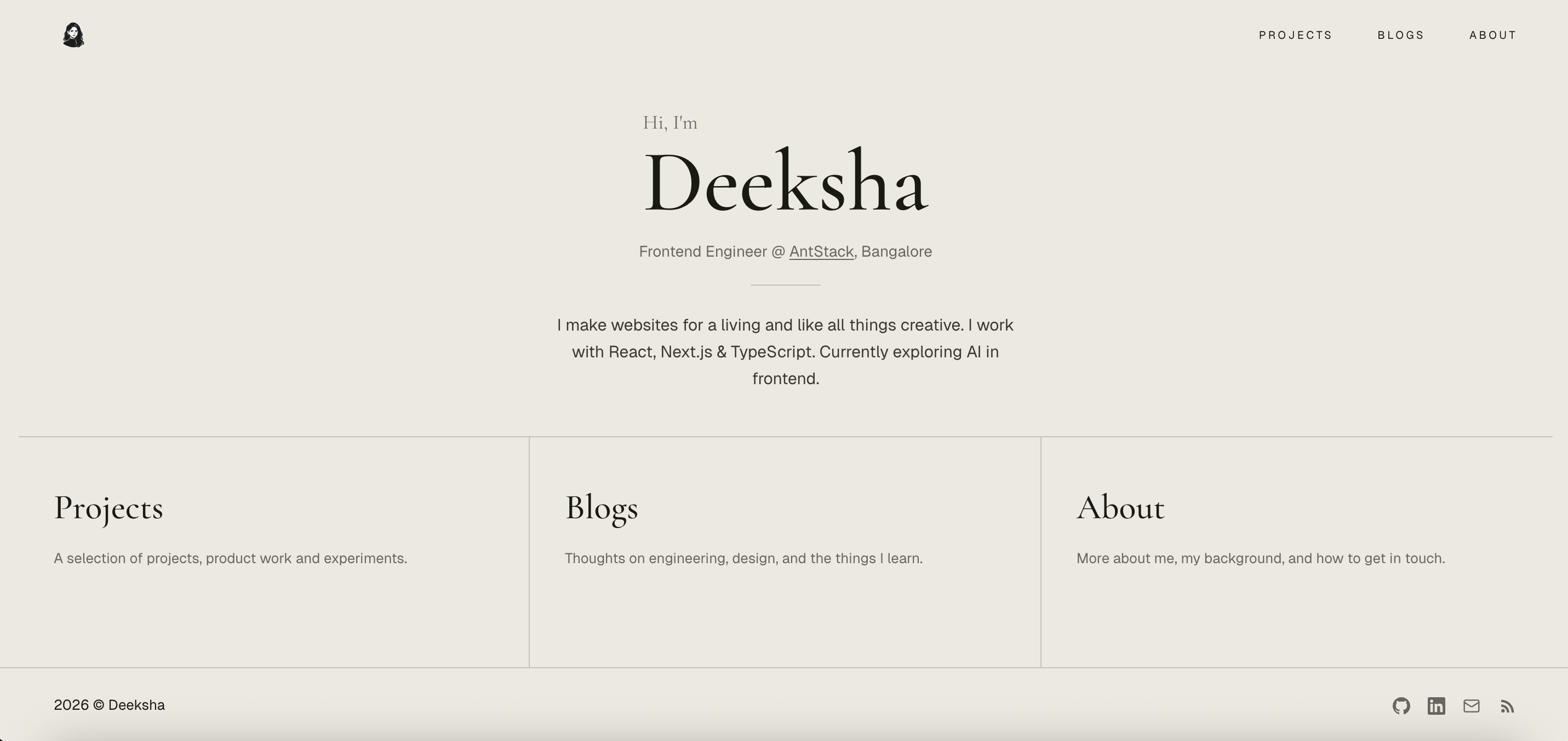
One day while doom scrolling I saw an ad for a photo frame where the sun moved up and down as you moved the strings (like the strings on wall mount fans) attached to it at the bottom. I liked it and my instant thought was how nice it'd look when implemented on a website. I saved the reel, my initial plan was to create it as a separate project, In January 2026, I started it, called it "amber" because of the yellowish color the sky looks when the sunsets and also it's a nice, cool short name. Randomly one day when I was going home from office, I thought why not include that design in my portfolio, I was very skeptical about how it was going to turn out, I gave image references from the ad and prompted claude to give me a editorial style (yes, I finally gave in and deicided to keep my website editorial, like the old fashioned way) sunrise -> sunset -> dawn -> night transition as we scroll. I particularly asked claude to keep it in soft illustration style. On a side note, when I was looking for platforms to deploy shortly, I had narrowed down to Railway and fly.io, when I was signing up, I instantly fell in love with the illustration on fly's sign up page, it reminded me of my primary class english text book. This was an inspiration for me to ask claude to keep the whole transition to have a soft illustration style. Though I had given a pretty small prompt, claude did a very good job on understanding my vision, I loved the first iteration and implemented the design over the weekend.
The Tech aspect
The main feature of the current design is a scroll-driven sky that transitions from dawn to midnight as you read down the page. It sounds more complicated than it is. The core idea is five keyframes five snapshots of the sky at different times of day and a scroll progress value between 0 and 1 that interpolates between them.
Each keyframe defines about twenty CSS custom properties: sky colours, sun position, moon opacity, hill colours, star opacity, bird visibility, and the ink/paper/accent palette used by the text and UI. As you scroll, all of these interpolate in real time.
The tricky part wasn't the interpolation that's just linear math. The tricky part was making the rest of the UI respond to it. The navigation pill, the text, the cards on inner pages they all needed to read the sky's current palette rather than a fixed set of colours.
I solved this by writing sky values to CSS custom properties on both the component root and document.documentElement. That way, the sticky header which lives outside the sky component in the DOM could still inherit the dynamic palette via var(--ink), var(--paper), and so on.
Why Not GSAP or Framer Motion?
The obvious question when you hear "scroll-driven animation" is: why not just use GSAP ScrollTrigger or Framer Motion?
Honest answer: GSAP could have done this. It wouldn't have been a stretch. ScrollTrigger with scrub: true is literally built for scroll-to-value mapping, and GSAP can animate CSS custom properties directly. It would have worked fine. Framer Motion is the weaker fit of the two it's component-focused and driving a global CSS variable from it feels awkward — but GSAP was a genuine alternative.
So why didn't I use it?
The cascade. This is the one thing GSAP genuinely can't replicate without extra work. When you set --ink on document.documentElement, every element on the page that uses var(--ink) updates instantly — the heading, the nav pill, the card borders, the footer, all of it. You set one value, the browser's CSS engine does the rest. With GSAP you'd need to target each element explicitly, or maintain a separate state system and push values down manually. That's more code solving a problem the platform already solves for free.
Bundle size. GSAP's core is around 25kb minified + gzipped, ScrollTrigger adds more. The entire sky engine here is about 80 lines of vanilla TypeScript a lerp function, a requestAnimationFrame loop, and some hex colour mixing. No dependency to version, no API to break on an upgrade.
SSR. Framer Motion has had friction with Next.js server components and hydration over the years. CSS custom properties with fallback values baked into every var() call render correctly on the server and progressively enhance on the client. No hydration warnings, no "use client" spreading further than it needs to.
To be clear, if I were building choreographed entrance animations, gesture-driven interactions, or complex sequenced motion, I'd reach for GSAP immediately. It's excellent at what it does. But for a scroll position that feeds twenty interpolated numbers into a CSS cascade, adding a library would have been bringing a knife to a pen fight.
Inner Pages and the "Daytime Sky"
I wanted the audience to focus on the content rather than the UI, so I intended to keep the /projects, /blogs, /about, and /beyond-code pages a daytime sky background.
This means the entire site shares one design system. There are no hardcoded colours in any of the pages. Everything traces back to the sky keyframe palette, which makes it easy to tweak the mood of the whole site by changing a handful of hex values.
Does It Actually Matter?
A portfolio is a strange thing to spend this much time on. It's not a product. It doesn't have users in the traditional sense. The ROI is genuinely unclear.
But more than anything else, it's mine. Not a template. Not a theme. Not a design system borrowed from somewhere else. Something I made and rebuilt until it felt right.
That's worth something. Even if I'll probably redesign it again in six months.